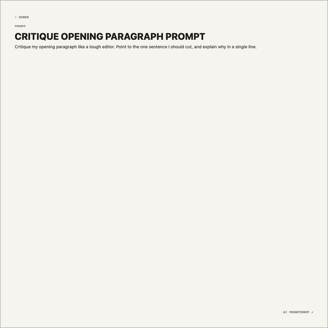
What Minimal looks like
It uses exactly the same colors as Clean, a warm gray-white (#f5f4ef), a darker taupe border and near-black text, but in the 1080-pixel square instead of Landscape. The real differences are the shape and the label: Minimal doesn't name a platform, so the image doesn't advertise any AI product.
A prompt of one or two sentences sits at the top under its bold heading, and the rest of the square is plain. On this template the emptiness is deliberate; it frames a short line the way white space frames a pull quote on a printed page.
When to pick Minimal
Choose Minimal for prompts that work like a quotation: one clever instruction, a reusable one-liner, the example on a slide about writing better prompts. It also suits documentation where naming a specific model would date the page or imply an endorsement. And when you can't decide between templates, it's a safe fallback, because there is nothing in it to clash with.
It's the wrong pick for anything long. Ten lines of gray text in a square look like a wall; use Research or Editorial for that. If you do want a platform named, Clean gives you the same look with the ChatGPT mark.
- short prompts
- quote-style prompts
- documentation snippets
- plain sharing
The example prompt
Critique my opening paragraph like a tough editor. Point to the one sentence I should cut, and explain why in a single line.
Two sentences, one job. That's close to ideal for Minimal: the heading and the prompt together take a couple of seconds to read, and the space around them does the framing.
Tips for Minimal
- Cut it until it stops working. If the prompt still makes sense with half the words gone, take them out. Minimal shows off every unnecessary clause, so it rewards the shortest version that still gets the job done.
- Keep the neutral label, or change it on purpose.
• OTHERis the default because a prompt like the example works in any chatbot. If yours only works in one tool, choose that tool in the editor so readers know where to paste it. - Hide the brand mark for slides. Branding can be switched off in the editor before you export. On a card this bare, the small corner mark is the only other thing on it, and a talk or handout looks cleaner without it.